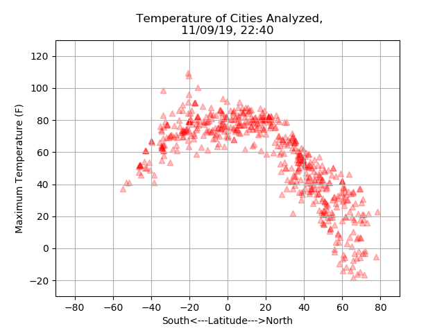
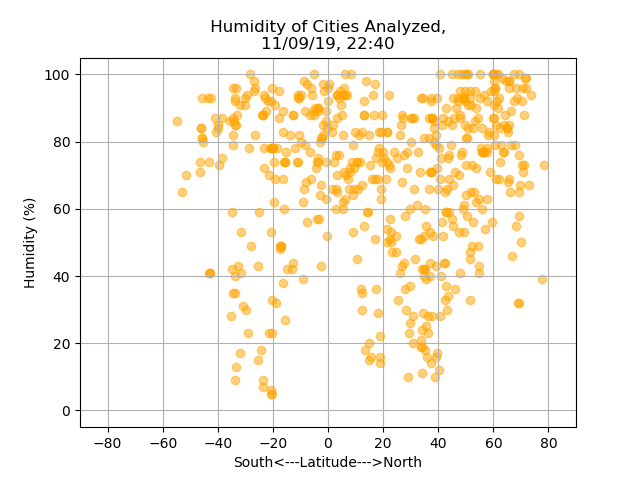
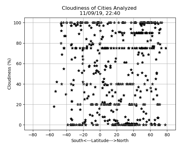
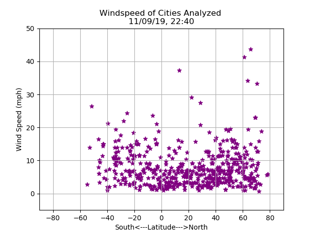
What's the weather like as we approach the equator?
The purpose of the project was to visualize the weather of 500+ cities across the world of varying distance from the equator.The data was pulled from the OpenWeatherMap API on 9th November 2019.
The data response received from the weather API on the day is accessible in the data section as table . Pandas and matplotlib were used to analyze various aspects of weather vs. latitude and a series of scatter plot were build to showcase the relationship. Weather aspects taken into consideration: temperatue, cloudiness, wind speed and humidity. A full range of latitudes were covered .This site provides the source data and visualizations created as part of the analysis as well as explanations and descriptions of any trends and correlations witnessed.
Visualizations